In one of my recent posts, I talked about the most important elements of an irresistible lead magnet. If you haven’t had the chance to go through it yet, you can check it out here: Lead Magnet Ideas.Today, I want to dedicate my attention to another, equally important part of the lead generation process – landing page examples 2018. It doesn’t matter how amazing your content is, if nobody gets to read it.
That’s why it’s important to properly promote your lead magnet on the landing page – using powerful, compelling copy and captivating visuals.
The only goal of any landing page examples below is to “lure” the target audience with an irresistible offer (like these lead magnet ideas). It needs to convince them to fill out the opt-in form and provide their contact information to access the free download.
Naturally, some landing page examples do a better job than others. In this post, I’m going to talk about…
5 Important Aspects To Increase Conversions And Some Landing Page Examples For 2018:
Write An Attention-Grabbing Headline
The first thing a visitor sees when they arrive at your landing page is the headline. That’s what makes the headline is one of the most important elements on the page. It’s also the reason why the headline is the first thing you should focus on.
On average, a person decides whether they are going to stay on the page and read through it, in the first 5 seconds.
This means you literally have 10-15 words to convince them that they came to the right place. If you don’t immediately grab their attention, chances are you won’t get a second shot.
That’s why you need to come up with an attention-grabbing headline. It needs to instantly sparks the visitor’s interest and make them want to learn what the offer is all about.
But, how do you do that? Obviously, different headlines work better for different niches and offers… Still, there are a few general rules and guidelines you can follow to write a captivating headline.
Like I said, you have very limited time to persuade the reader to stay on the page. Hence, the headline needs to be short and to the point. It also needs to play to the main benefit they will receive from your free offer.
Avoid using confusing terms, or going overboard with the adjectives. Be clear on what it is you’re offering. Also, always tell the reader what they can expect to gain from taking you up on that offer.
Test Different Headlines
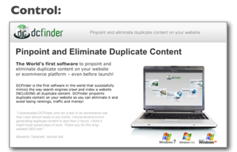
Image by crazyegg – dc finder
It shouldn’t take more than a quick glance to fully understand what your offer is all about. Thankfully, you can easily test this.
Ask one of your friend or colleagues to read the headline you come up with. Then, have them explain to you what they think you’re offering. If they’re way off, that means your message isn’t clear. In that case, it’s back to the drawing board.
That said, you don’t want to reveal everything in the first sentence. Hint at the main benefit, but don’t go into too much detail (see image above). Your goal is to get them excited enough to the point where they’ll gladly give you their email address to get the full information from your content.
Also, make sure it’s abundantly clear that it’s a free offer. There’s no reason to be shy here; the direct approach works best.
Use Bullets To Get Your Message Across
Remember that everyone’s time is precious, and nobody wants to waste 15 minutes reading about how amazing your content is. Hell, you’re lucky if they spend that much time reading the content itself.
So, when you’re writing the body of your landing page, don’t beat around the bush. Try to convey your message in as few words as possible. There is various free landing page examples online that do very bad job at this.
One of the best strategies here is to use benefit-driven bullets. They’re scannable and much easier to read than huge chunks of texts. When writing bullets, make sure they tell the visitors what they’ll learn and how they’ll benefit from your lead magnet.
Keep in mind that the goal you want to achieve with any landing page examples you create is to get the visitors to fill out the form and click the call to action button at the bottom. The sooner they reach the CTA, the better.
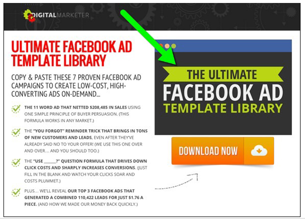
Image by digitalmarketer – facebook ad
Countless split-tests have proven that reading time significantly impacts the conversion rates. Consequently, long paragraphs usually do more harm than good.
Split-tests have also shown that, on average, bullets drastically improve the landing page conversion rates. So, there’s another reason why you’d want to take full advantage of them.
However, if you thought writing a couple of bullets is easier than trying to explain everything through plain text, you’re in for a surprise.
The trick is, you need to explain both what the content is about, and benefit the reader is getting, in a single sentence. You also need to include power words that stimulate an emotional response in the reader.
Think about how your lead magnet will help them solve a problem or achieve a goal. Then, try to envision the impact that would have on their life and/or business.
Make Sure The Page Is Visually Appealing
Whatever you do, the last thing you want is to underestimate the role powerful visuals can have on your landing page conversion rates. That is why is important to create various landing page examples.
They can have a strong positive effect on the reader, and get them in the right mood. Needless to say, this makes the decision to download the lead magnet that much easier.
Images have multiple uses, aside from portraying emotions. For instance, you can also leverage them to help visitors identify with your products. They’re also a great way to grab the reader’s attention. Images can even help people envision a certain lifestyle your product enables.
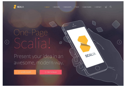
Image by colorlib – scalia theme
Let’s say your lead magnet is a collection of Paleo recipes. An image of a fit and happy person preparing or eating a Paleo meal will bury itself into the visitor’s mind. They’ll then start picturing their life once they manage to lose the extra weight.
That said; make sure you don’t overdo it with the visuals. They should be used to help enhance your message, not hinder it. Use them as a background, an emotional foundation for your page – not as a distraction.
Another thing you need to think about, when it comes to the visual appearance of your landing page, are the dominant colors. The best practice is to use the colors that are typically associated with your business and brand.
Also, always use a contrasting color for your CTA. The reason for this is because you want the CTA to be easy to spot. Having the contrast of colors will ensure it really stands out from the rest of the page.
Don’t Over Promise
I can’t tell you how many times I’ve seen marketers (even seasoned ones) make this rookie mistake.
Obviously, you want to do everything in your power to attract as many people as possible, and convince them to give you their email addresses in exchange for the content.
However, regardless of how good the content is, there’s one thing you should never do, under any circumstances – overpromise.
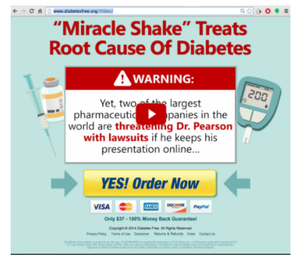
Image by godiabetesfree
Overexagerating is more likely to push people away from your business, than it is to attract them. Even if they buy into what you’re saying on the landing page, if the content doesn’t deliver on your promise, the lead is guaranteed to be frustrated.
Best case scenario – they’ll just unsubscribe and make peace with the fact that they’ve wasted their time. Worst case scenario, however, they’ll post negative comments on your website, forums, or social media, ruining your reputation.
So, whatever you do, be truthful to your subscribers. Let your content do the talking for you instead, and only talk about the actual benefits they’ll receive from your lead magnet.
Have A Clear Call To Action
The Call to Action (CTA) is what your entire landing page comes down to. It’s the action you want the visitors to take before leaving the page.
As you can see in the landing page examples above, the goal is pretty much always the same – fill out your contact information to receive the free download.
Plain and simple, just like your CTA should be. Don’t hesitate to tell the visitors exactly what they need to do. Tell them leave their name and email in order to claim the free report, download the eBook, start their free trial, etc.
The general rule of thumb is to be as straightforward and clear about it as possible. Also, they should only have two options on your landing page: they can either a) opt-in and download the lead magnet or b)leave the page entirely.
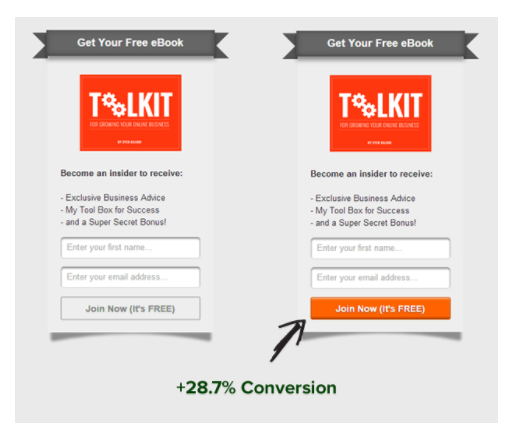
Image by 7and7 – e business toolkit
So, you want to have a single CTA. A large button in the center of the screen which “sticks out” and is the focal point of the page, works best. It should be pretty much impossible to miss.
Don’t give them a bunch of clickable links. Refrain from adding a header that can redirect them to your website. The only goal with these landing page examples above is to get as many leads as possible and quickly grow your mailing list.
That’s why the CTA should be the only thing they can interact with on the page.
Once they submit their contact information, you can redirect them to a “thank you” page that promotes one of your paid offers, or send them back to your website.
It goes without saying, you can promote all your offers and content through the emails, for as long as they remain subscribed.
To Sum It Up
These are the key elements of any high-converting landing page, and if you follow my advice, I have no doubt that you’ll be able to create a killer landing page and grow your email list in no time!
One final tip: Once you have a good grasp on the basics, it’s best to run split-tests and tweak each segment of the page and compare the conversions to learn exactly what works best for your target audience.
Even a small change like a single word in the headline, or a different color of the CTA button can have a huge impact on your conversions.
Need help creating an irresistible lead magnet and a high-converting landing? Then I invite you to sign up for my Cashflow Kickstarter course.
This comprehensive, step-by-step educational training guides you through the entire process of creating and setting up a powerful sales funnel (including lead magnets, landing pages, webinars, and emails) that will skyrocket your income.
Check out the Cashflow Kickstarter and discover how you can scale your profits to 6 or even 7 figures!
About The Author
Your Millionaire Mentor
Shaqir Hussyin

Shaqir Hussyin is the founder and CEO of WealthAcademy.com & Funnels.com. Nicknamed the “Backpack Millionaire”, he’s invested $350,000 into his own education and training. Whilst traveling to 100+ countries, Shaqir has built over 10+ million dollar brands and attracted over 500,000+ subscribers.
His signature program is now available: Max Income System; 14 Simple Steps To Making Your First Income Online
Shaqir is also a highly sought-after speaker and direct response “Sales Funnels” global leader. His work has impacted over 100,000 businesses in 65 different countries. Connect with Shaqir on Instagram, YouTube, LinkedIn & FB Group.